Visual hierarchy and readability
Ranking what the player sees, from most to least important, so a scene reads at a glance. In games, readability is a gameplay requirement before it is an aesthetic one.
Visual hierarchy is the order in which a viewer notices things: what they see first, second and last. Readability is how quickly and reliably they can tell what they are looking at. In a painting these are matters of taste. In a game they decide whether the player spots the enemy, finds the exit or walks past the item they need.
The core idea is that contrast attracts attention, so spend it on what matters and keep everything else calm.
#Three tiers
A simple way to plan hierarchy is to sort everything in a view into three tiers:
- Primary: what the player must read now. Characters and enemies, the exit, the objective, interactive objects.
- Secondary: what helps them understand the space. Landmarks, cover, paths, the shape of the room.
- Tertiary: what makes it believable. Surface detail, clutter, background buildings, sky.
Piaskiewicz describes the top of this ladder in composition terms: the dominant is "the focal point of the composition, it can't merge with the rest of the scene's objects", supported by a weaker counterpoint (Game Developer: Composition in Level Design). The focal point page covers that top tier; this page covers the whole ladder.
The tiers echo the primary, secondary and tertiary forms idea from sculpting (primary, secondary and tertiary forms), applied to a whole scene instead of one object.
#Tools for emphasis
Every tool below works by contrast with what surrounds it. Piaskiewicz's list of visual weight is a good summary: heavy elements have "Large scale, detailed, dark color, intensive color, heavy contrast"; light ones have "Small scale, stark appearance, light color, soft color, light contrast" (Game Developer: Composition in Level Design).
| Tool | Raises emphasis | Lowers emphasis | See |
|---|---|---|---|
| Value | Strong light–dark contrast | Values close together | value |
| Colour | Saturated, contrasting hue | Muted, similar hues | colour for environments |
| Light | "The most important objects should be well lit" (Game Developer) | In shadow | light and shadow |
| Detail | Dense, sharp detail | Large calm surfaces | set dressing and art passes |
| Shape | Distinct silhouette, unusual shape | Repeated, generic shapes | shape language |
| Scale | Bigger than its neighbours | Small, repeated | scale and proportion |
| Motion | Moving, flickering | Static | focal point |
| Lines | Lines converge on it | Lines lead away | leading lines |
Players respond to the same list. The Level Design Book's wayfinding guidelines, drawn from Half-Life 2, include: "Players focus on contrast (in color, shape, lighting, and movement.)" (The Level Design Book: Wayfinding).

#Readability as a gameplay requirement
Studios that make competitive games treat readability as a rule, not a preference.
Moby Francke, co-author of the Team Fortress 2 paper (Mitchell et al. 2007), described VALORANT's goal in an interview: "We're not trying to make the most beautiful game ever, we're trying to make an accessible game that everybody can play" (Inverse: "We're not trying to make the most beautiful…).
#Hierarchy in story-driven games
Narrative games share the same toolkit but have more room for mood. Naughty Dog lighting artist Gabe Betancourt describes using light to "entice players to pay attention to an object, location, or help with puzzle", and to decide "where to guide or distract players", while "making sure enemies and cover in an area remain distinct" (80 Level: Learning Lighting for Video Games). John Sweeney, art director on The Last of Us Part II, describes art direction helping designers "find solutions to things like composition and shape reads" (Cook & Becker: Art directing The Last of Us Part II).
The Level Design Book suggests a hierarchy for lighting exits: "Big important exits should have more important looking lighting" (The Level Design Book: Lighting). This applies visual hierarchy to navigation.
#Detail budget
Hierarchy fails most often because detail is spread evenly. Every prop, decal and trim adds a little contrast, and together they turn into noise that hides the primary tier. Treat detail like a budget: cluster it near focal points and along the critical path, and leave large calm areas elsewhere. The composition page has a well-known guideline on the ratio.
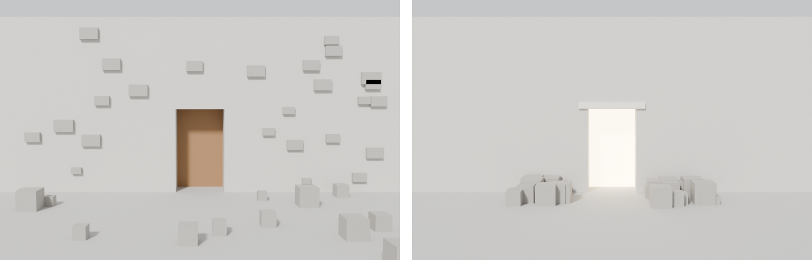
Andrew Lund III found this in his winter street scene: "My composition had no clear focus" (80 Level: Winter Street Scene: Environment Production…). He made the arched door the primary focal point, treated an alley and a tunnel as secondary interest, and used snow mounds, vertex painting, boot tracks and a door left slightly open to lead the eye to the entrance (80 Level: Winter Street Scene: Environment Production…). The fix was reorganising existing contrast, not adding more of it.
#Using more than one cue
A hierarchy built on a single cue is fragile. Colour cues fail for colour-blind players; Microsoft's guidelines require critical information to use "at least one additional signifier such as shape, pattern, iconography, or text labels" (Microsoft Learn: Xbox Accessibility Guideline 103). Build the primary tier from two or three cues at once: light and value and shape, for example.
#How to test hierarchy
- Two-second test. Show a screenshot for two seconds and ask what people noticed, in order. Compare with your three tiers.
- Greyscale and squint. If the primary tier disappears, it relied on colour.
- Character test. Place a character (or enemy) model in front of every common background in the space and check it stays readable.
- Thumbnail test. At 200 px wide, only the primary and secondary tiers should still read.
- Playtest. Watch where players look and go. See playtesting spaces and telemetry and heatmaps.
#Related pages
focal point · composition · value · colour for environments · light and shadow · silhouette · leading lines · wayfinding · set dressing and art passes · art fatigue
#Further reading and watching
References
- · Composition in Level Design · Game Developer, 2014 · article · accessed 2026-10-21
- · Wayfinding · The Level Design Book · web · accessed 2026-10-21
- · Illustrative Rendering in Team Fortress 2 · NPAR 2007 / SIGGRAPH 2007 course notes, 2007 · paper · accessed 2026-10-21
- · The Art of VALORANT Map Environments · playvalorant.com, 2020 · article · accessed 2026-10-21
- · "We're not trying to make the most beautiful game ever." (VALORANT art style interview with Moby Francke) · Inverse · article · accessed 2026-10-21
- · Learning Lighting for Video Games · 80 Level, 2017 · article · accessed 2026-10-21
- · Art directing The Last of Us Part II · Cook & Becker · article · accessed 2026-10-21
- · Lighting · The Level Design Book · web · accessed 2026-10-21
- · Winter Street Scene: Environment Production Breakdown in UE4 · 80 Level · article · accessed 2026-10-21
- · Xbox Accessibility Guideline 103 · Microsoft Learn · docs · accessed 2026-10-21
Pages that link here
- Leading lines Key term
- Value Topic
- Notan and value thumbnails Key term
- Colour blindness and accessibility Key term
- Kitbashing Topic
- Hero assets, props and filler Topic
- Primary, secondary and tertiary forms Topic
- Hand-painted and stylised texturing Topic
- Fog and atmosphere Topic
- Combat spaces and arenas Topic
- Teach, test, twist Key term
- Landmarks Key term
- Set dressing and art passes Topic
- Art bibles and style guides Reference
Last updated 2026-10-22